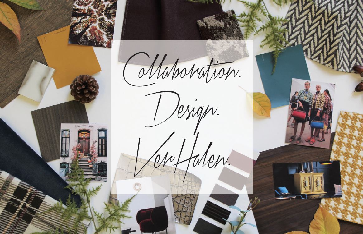
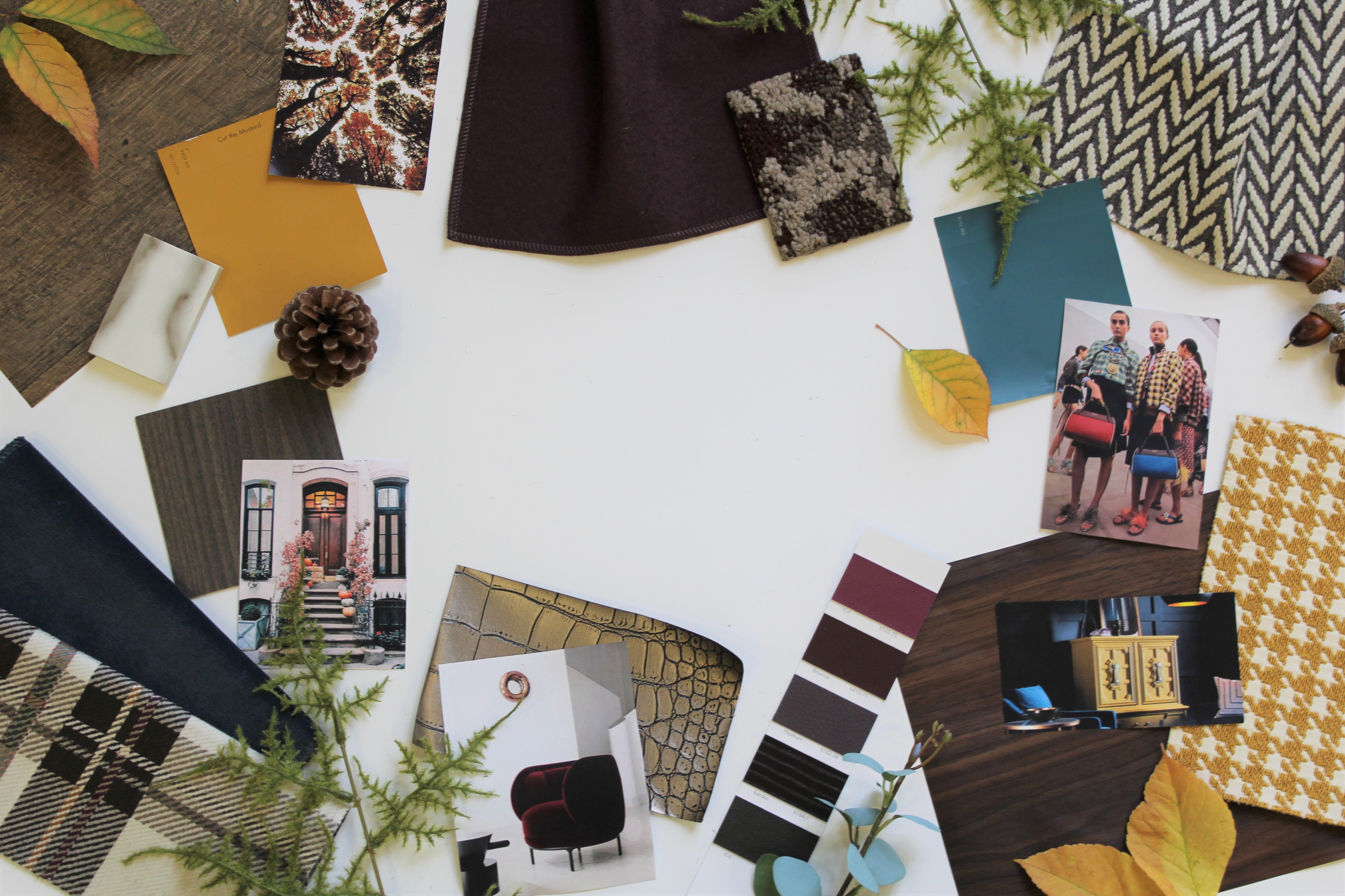
After we completed our inspiration palette for summer and the leaves began to change with cooling temperatures, our design team started collecting materials for our fall palette, which is warm, earthy and textural. Not familiar with our seasonal palette projects? Our goal is to embody the essence of each current season while utilizing various materials that are used in interior design.
With the temperatures and amount of daylight dropping rapidly, many people turn inward during the fall. The comfort that sweaters, soft blankets and hot drinks bring is soothing with winter gradually approaching. We brought in cozy fabrics, like velvet and felt to capture this need to stay warm with transitioning weather. We also took inspiration from fall fashion and brought in common prints found during the season, such as plaid, houndstooth, and herringbone. Wallcovering that closely resembles wood grain brings in texture and warmth for an autumn look and feel.
For our palette, we utilized natural elements like acorns, pine cones, and greenery. The changing fall foliage never fails to surprise and delight us during the season, so it was a must to decorate the palette with crispy autumn leaves. In regards to colors, we went with gold and deep burgundy to represent the warmth of the changing foilage, brown to exude an earthy feel, and teal to contrast well with the warmer colors.
Products
Here are the products that are featured on our palette:
Upholstery Fabric: Healther Felt by Luum (in the colorway “Acai”) is a classic, 100% wool felted construction with a supple hand and variegated heathered appearance. Heather Felt’s flannel texture can be used to soften environments and create a sense of comfort and warmth.
Upholstery Fabric: Carnegie‘s Heritage (in color number “22”) lifts its inspiration from the herringbone pattern, one of the most popular cloths used for classic menswear suits and outwear. Exaggerated scale and offset motifs provide ground for a more contemporary, fresher look.
Upholstery Fabric: Holmes by Designtex (in the colorway “Gold”) has a classic houndstooth pattern, which is a duotone textile pattern characterized by broken checks or abstract four-pointed shapes. Often in black and white, this specific pattern is in gold, which is meant to emulate the gold leaves of fall.
Upholstery Fabric: HBF Textiles‘s Hipster (in the “Willis Watch” colorway) is a large-scale plaid design. Plaid is the ultimate fall print and this specific plaid is sophisticated and fashionable.
Upholstery Fabric: Velvet Underground (in “Blue Denim) by Luum speaks to the supple hand and soft texture of more traditional velvets, but is recreated in polyester to perform for contract use. The subtle palette takes its cues from rich neutrals and updated jewel tones. Velvet was an easy choice as it is trending in both the fashion and interiors world.
Upholstery Fabrics: We placed Carnegie‘s upholstery fabric card on our palette because of its dark violet and red wine colors (which includes fabrics Kid, Bounce, Hepburn, and Bardot).
Laminate: This laminate is from Teknion‘s award-winning furniture series, Zones. Titled “Greystone Beach,” this finish resembles a grey wood. Grey has been widely popular in the past several years. Lately, we’ve been seeing it in woods, laminates and luxury vinyl.
Paint: Deep Sea Dive from Sherwin-Williams closely resembles their 2018 color of the year, Oceanside. It’s a rich, comforting color that bridges together blues and greens.
Paint: Cut the Mustard from Sherwin-Williams was an easy choice for our palette as mustard yellow is often seen in fashion during the fall season. This color can also be found on autumn leaves.
Wallcovering: D.L. Couch‘s Zambezi (in the color “Tugela”) is a unique faux snakeskin wallcovering that comes in a variety of metallics.
Wallcovering: Hand Sawn Woods (in “Retted White Ash “) from D.L. Couch brings in a rustic and weathered look that’s charming and textural.
Wallcovering: D.L. Couch’s More Woods (in “Brazilian Rosewood”) is a wallcovering that mimics a rich wood with deep red undertones.
Carpet: Interface’s Global Change Collection was just released this past summer at NeoCon. The collection is inspired by nature’s transitions. Using organic patterns and linear textures, this collection draws connections between people and earth, morning and evening and dark and light. The specific pattern that we chose for our palette is Raku (in the color “Fawn”) and looks like sun darting through the trees that creates unique shadows on a forest floor.
Tile: Marble Attache (in “Calacatta Marble”) from Daltile is a ceramic tile with a beautiful marble interpretation. Marble is an extremely popular natural stone due to its unique veining, elegant look and interesting history.


